One of the winners at GDP #037! I wasn't expecting it as there were so many beautiful cards. TY GDP!
_________________________________________________________________________
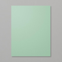
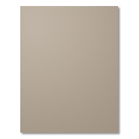
 Have you ever created something where while your were making it you started to question your choices? Well I did. I decided to participate in the Global Design Project Challenge #037 this week, and it turned out to be a colour challenge using Tip Top Taupe, Mint Macaron, and Island Indigo.
I decided to show Island Indigo as the dominant colour, but when I was creating all the parts to the card and saw them all lying there in front of me, I began to question my colour choice. It might look too dark. Maybe I should create another one but just use the challenge colours as splashes of colour.
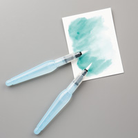
So since I was in the watercolouring stage, I quickly stamped more blossoms and leaves and painted more for another colour choice for a second card. (Oh, I forgot to mention that I stamped the blossom and leaves in Archival Basic Gray ink). Once I had everything all die cut, punched out, or fussy cut out, and was ready to assemble the two cards, I still wasn't sure about them. Once the cards where completed I decided that they booth looked pretty good, but which one is the better one to enter. Now every time I look at the two cards I change my mind as to which card I prefer. First I decide I like the darker one, and then the next time I look, I prefer the lighter card. And so on...
Here are the two cards. You can see that they are almost identical, but give a very different look.

Let's have a closer look at each of them, shall we.


In the next photo you can see that I stamped the sentiment twice and cut the banner form one to pop over the other one.

For this card, I stamped the background blossoms in Tip Top Taupe before water colouring the background starting with the Tip Top Taupe strongest in the left bottom of the "Lots of Labels" die cut, blending into Mint Macaron, and then into Island Indigo in the upper right. I wanted to do this to see if the water would fade the background blossoms and blur them into the background. It worked to a degree, but also made the Tip Top Taupe look somewhat pink in places.

The side view below shows the layering on this card.

For the inside, I had some of the fussy cut leaves left over and glued it into the inside of the card.

Now, to show you the details of the lighter version created with Very Vanilla as the base.

The card's side view is next.

For the background water colouring on this "Lots of Labels" die cut I did the water colouring first, before off stamping the bunches of blossoms lightly in the background. I also changed the order of the water colours. I started with the Island Indigo in the bottom left this time, blending into the Mint Macaron, and then into the Tip Top Taupe on the upper right.

I again stamped the sentiment twice to cut the banner out and pop it up over the sentiment on the die cut.

The layernig of the card and popped up parts are seen in the next photo.

And for the inside, I used the leftover water colour pieces that I didn't get used on the fronts of the cards.

So there you have my story on these two cards. Is there one that you prefer over the other? I'd be interested in knowing.
Be sure to check out all the inspiration at GDP this week!
Happy stamping!


SALE STAMP SETS NOT IN THE CURRENT CATALOGUE!

Hello everyone!
Did you know that there are stamp sets on sale that are not in the catalogue? Are you interested in seeing them? Below is a snap of the items...

...and here is the link to the PDF file if you need to see it a little larger.
Just email me and let me know the name and codes to the stamp sets you are interested in ordering before the end of May!
Extra Stampin’ Rewards!
For the month of June, you can get $40 in Extra Stampin' Rewards
when you host a stamping event with $400 or more in
sales. That’s more money you can use for products in the new annual
catalog, and you know there are PLENTY of new products you’ll want to
bring home. Remember, Stampin’ Rewards can be used on a Starter Kit, so
this is a great time for you to sign up with me!

Details
- Hosts who have qualifying events with $400 CAD or more in sales during the promotion period (June 1 - 30) will receive $40 CAD in Extra Stampin’ Rewards for the order.
- Hosts may participate in this promotion multiple times by hosting multiple events, but each event must qualify on its own.
- Customer, workshop, and online orders qualify for this promotion.
- Qualifying orders must qualify with merchandise prior to shipping and tax.


6 comments:
I am so glad you decided to post both cards because that are both beautiful and it would be unfair to pick a favorite. Thanks for joining us this week at Global Design Project.
Sabrina as always these cards are simply works of art. Given a choice I would hands down choose your original darker version, although I do like the second one too. Thanks for sharing your inspiration.
Well, I love them both for different reasons. The dark is dramatic and loud, while the light is subtle and soft. I am so glad you decided to share both. Thanks for playing at Global Design Project with us this week.
Your cards are simply wonderful. You have used the colours so very well. Thank you for playing at Global design Project this week.
These cards are absolutely gorgeous, Sabrina! I love how you've colored these flowers and arranged them beautifully. Such a brilliant use of these colors. Thank you so much for playing along with this week's Global Design Project color challenge!
Sabrina, Congratulations 1st prize of GDP # 037 !
Post a Comment